No matter how well-designed a marketing measure is, it will fall flat if the last step is missing: the call-to-action (CTA), the clear call to action. A CTA is exactly that. A direct invitation to the user to do something. Buy. Register. Download. Test it. Without this clear message, interest often remains inconsequential.
CTAs guide user behavior, provide orientation and turn passive visitors into active customers. At a time when attention is scarce, the right CTA determines the success or failure of a campaign.
That's exactly what this article is about: We show what makes a successful CTA, how it affects the conversion rate and how you can design it so that it really works.

Table of contents
What is a call-to-action (CTA)?
A call-to-action (CTA) is a clear, direct call to action that prompts the user to take a specific action. This action can take many forms, from buying a product or subscribing to a newsletter to downloading a file or filling out a form. The CTA is usually a button, a text link or an eye-catching button that clearly shows the user what to do next.
In marketing, the CTA is used specifically to steer the user's behavior in the desired direction. A simple but well-placed CTA can make the difference between a passive visitor and an active customer.
Why CTAs are important for conversion optimization

Another important aspect of CTA optimization is the A/B testing. By testing different variants of a CTA, for example in terms of text or placement, companies can find out which version achieves the best results. A/B testing makes it possible to continuously refine the CTA strategy and thus maximize the conversion rate.
A case study by HubSpot shows that personalized call-to-actions can significantly increase the conversion rate.
Best practices for A/B testing:
To design a successful call-to-action, there are a number of best practices that increase the likelihood that the user will actually take action. These best practices go beyond basic design considerations and take into account how text, color, placement and other elements work together optimally. With tools like Varify.io, these factors can be effectively tested and continually refined to maximize conversion rates.
Text
The text of a CTA should not only encourage action, but also clearly communicate what the user can expect in the next step. A CTA such as "Try now for free" or "Get your offer" creates transparency and reduces uncertainty as to what exactly will happen when the button is pressed. This increases the likelihood that the user will actually take action as they know what to expect.
Color
The choice of color for the CTA has a strong psychological effect. The complementary color to the design of the page is often used to highlight the CTA. These colors stand in stark contrast to the other elements on the page and immediately attract attention. For example, on a page with blue or green tones, red or orange is often used for the CTA. These colors signal urgency and importance, which motivates the user to take action.
Placement
The position of the CTA is crucial. On desktop websites in particular, it has been shown that CTAs that are placed above the fold (i.e. in the visible area without scrolling) often achieve higher click-through rates. On mobile devices, it is sometimes advisable to design the CTA as a sticky button that always remains visible when scrolling. This keeps the CTA in the user's field of vision, even when they are navigating through the content of the page, which increases the chance that the user will perform the desired action.
Size and shape
The size and shape of the CTA button also play a role. The button should be large enough to attract attention without appearing cluttered. A round shape can appear friendlier and is often well suited for addressing users, while square buttons can create a more professional and structured atmosphere. The shape should also fit in well with the design of the page without distracting from the rest of the layout.
Personalization
A personalized CTA can significantly increase the conversion rate. If the CTA is tailored to the user, they feel more directly addressed. An example would be "Welcome back, Max! Get your offer" here the user is addressed directly by name, which creates trust and promotes a stronger emotional bond. Personalization can also be achieved through context, such as "Get your offer now, only available to you".
CTA strategies for different platforms and channels
Call-to-actions (CTAs) are not universally applicable; their design and positioning must be adapted depending on the platform and channel. Whether on the website, in social media, in emails or in mobile apps: each platform has its own requirements and best practices. A CTA that works perfectly on a website can have a completely different effect on Instagram or in a newsletter.
1st website
On websites, it is crucial that CTAs are both visually prominent and strategically placed. As discussed in the best practices, the CTA should be above the fold and immediately call the user to action. On product pages, CTAs such as "Buy now" or "Learn more" can be used to lead the user into the purchase process. Cleverly linking CTAs with further information (e.g. "More details on shipping options") also increases the conversion rate.
2. social media:
Social media offers the opportunity to place CTAs in an interactive and often visual way. On platforms such as Facebook, Instagram or LinkedIn, it is particularly important to integrate the CTA into the text or visual presentation. For example, a CTA on Instagram could read: "Swipe up for more" or "Comment and win". The challenge on social media is that users often have different expectations, they scroll through content and need to be convinced to take an action in a short space of time.
3. e-mail marketing:
CTAs in emails must be particularly well thought out, as readers usually already have an interest in the topic. Email CTAs should be clear and action-oriented, for example "Request now", "Download now" or "Register here". It is also important that the CTA is clearly visible and placed in several areas of the email, ideally both at the beginning and at the end of the message.
You can find more helpful tips in this article on more effective newsletter CTAs: 9 tips for more effective newsletter call-to-actions.
4. mobile apps:
In mobile apps, CTAs often need to be even more compact and direct. Users on mobile devices are used to acting quickly, so CTAs should be clear and direct. Buttons need to be large enough to click easily, and mobile-specific features such as push notifications should also be integrated into the CTA process. The use of sticky CTAs that remain visible during navigation can be particularly effective here.
Call-to-action examples that led to success: insights and case studies
Successful call-to-actions are not just a question of design, but also of strategy. To understand how CTAs can be used optimally, it is worth looking at real examples that show how companies have successfully designed their CTAs and achieved significant improvements in their conversion rate as a result.
1. amazon
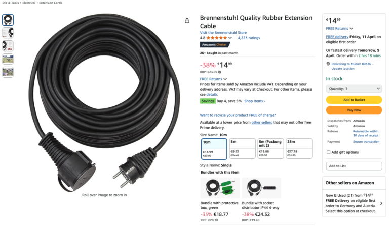
Amazon is a prime example of the successful use of CTAs. The "Add to cart" button is particularly striking, clear, eye-catching and direct. The CTA works so well because it communicates exactly what the user should do and is also combined with personalized recommendations. The "Buy now" button, which appears after the item selection, creates an immediate call to action that is coupled with a clear expectation: the user knows that they will complete the purchase.
2. airbnb
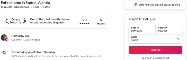
Airbnb uses CTAs that appear simple at first glance, but are reinforced by psychological triggers such as social proof and urgency. The "Book Now" CTA is often combined with cues that an accommodation is "popular" or "only a few available". These cues increase the sense of urgency and motivate users to act quickly.
3. dropbox
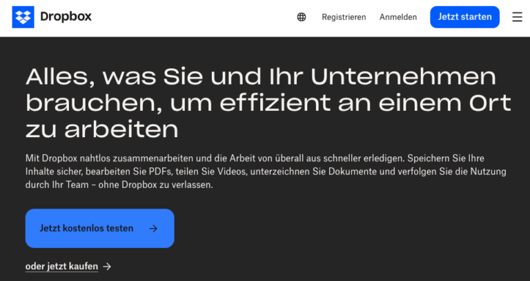
Dropbox has another example of a clear and effective CTA. On their landing page, the "Start now" CTA is combined with a greatly simplified offer: Users only need to sign up to try the service for free. This simple, action-oriented CTA reduces any uncertainty and provides instant access to a free trial.
4. booking.com
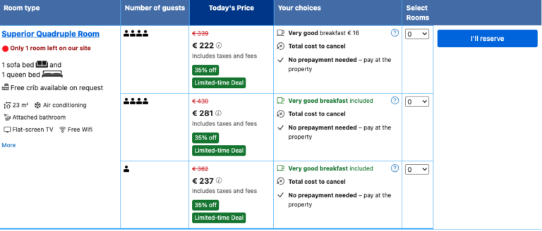
Booking.com uses the CTA "I'm booking", which is often combined with "High demand" or "Only 1 room left". These techniques utilize the psychological principles of urgency and scarcity and encourage users to book quickly before the opportunity is missed.
Conclusion: A strong CTA is decisive
Whether on the website, in emails or on social media - a call-to-action is never just an accessory. It is the final link in the chain between attention and action. Those who use the CTA strategically not only increase their conversion rate, but also improve the overall user experience.
The key lies in clarity: users need to know what they should do and why this action is worthwhile for them. Good CTAs are visible, understandable, relevant and tested. They are based on the context, adapt to the channel and use psychological triggers without being intrusive.
In the end, a single button often decides whether interest turns into interaction. Those who consistently use the potential of the CTA turn clicks into customers.