

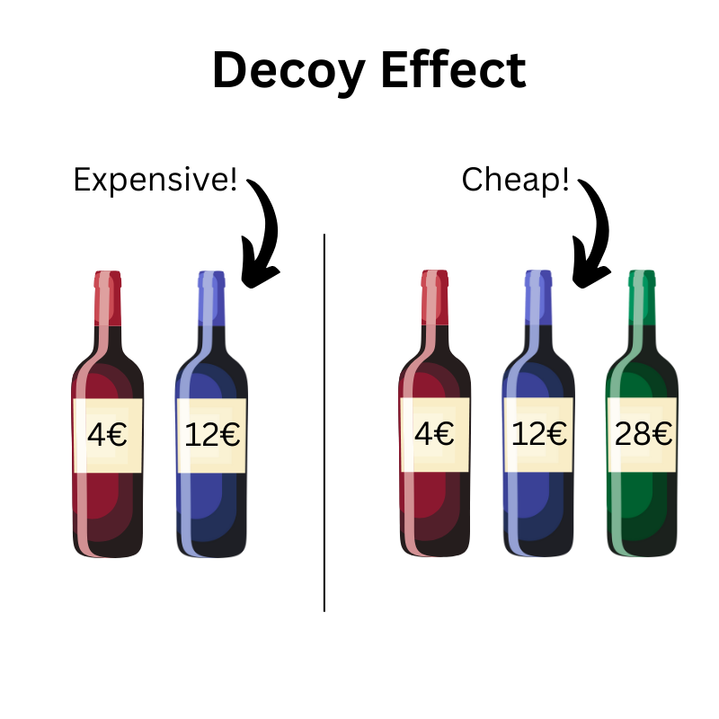
An evening in the restaurant, wine list in hand. There are three options to choose from:
The house wine seems functional. The Riserva sounds like a special treat, but it is also the most expensive.
Then the Chianti. High quality, but significantly cheaper than the top wine.
The decision is easy: Chianti seems to offer the best value for money.
What happens here is no coincidence. It is a psychological mechanism that elegantly guides our decision, known as the Decoy Effect.
The principle behind it:
A deliberately placed "bait option" - in this case the most expensive wine - makes another option more attractive without itself being chosen frequently. Our decision is not absolute, but relative: in comparison, the Chianti suddenly seems particularly reasonable.
- House wine - 18 €
- Chianti Classico - 33 €
- Pinot Grigio Riserva - 36 €
What is the Decoy Effect? Simply explained
The Decoy effect describes a psychological phenomenon in which the addition of a specifically designed third option changes the perception of the other two and thus shifts the probability of a decision.
The trick: The additional option ("Decoy") is clearly inferior, but only in comparison to a specific alternative. As a result, this dominant option suddenly appears particularly attractive.
Example:
| Option | Price | Performance | Effect |
|---|---|---|---|
| A: Base | 10 € | 1 Feature | Too little |
| B: Decoy | 16,50 € | 3 Features | Irritatingly close to C, but worse |
| C: Premium | 18 € | 5 Features | Good deal |
Formulated technically:
The decoy effect works when an alternative is asymmetrically dominated: It is inferior to one option in all respects, but not directly comparable to another. This deliberate imbalance activates our tendency to make comparative rather than absolute decisions.
Differentiation from related effects:
- Anchoring: An initial value (e.g. high price) influences our assessment of all the following options
- Framing: How information is presented (positive/negative) influences our decision
- Decoy: An additional option changes the attractiveness of existing alternatives
The difference: The Decoy effect requires at least three options and thrives on a targeted comparison, not on mere context.
The psychology behind it: Why the lure tricks our brain
Why does the decoy effect work so reliably, even for experienced decision-makers? The answer lies in the way our brain processes complex information: fast, comparative and often irrational.
System 1 vs. system 2 - the inner shortcut
The psychologist Daniel Kahneman distinguishes between two modes of thinking:
- System 1: Fast, intuitive, emotional
- System 2: Slow, logical, exhausting
Price decisions in everyday life, such as subscriptions, menu options or bundles, are almost always made via System 1. Our brain searches for simple heuristics: What seems like a good deal? Where do I lose the least? This is exactly where the decoy effect comes into play, because it manipulates the relationship between the options in a targeted manner.
Cognitive distortions
The decoy effect is a kind of super-combination of several psychological distortions:
- Contrast effect: An option looks more attractive if it is next to an obviously worse one
- Comparison heuristic: We prefer options that clearly stand out from others
- Loss aversion: Better to take something supposedly better so as not to risk a disadvantage
In short, our brain is looking for relative superiority, not objective quality.
The famous example of Dan Ariely
A classic: US economist Dan Ariely examined the price structure of the Economist subscription:| Option | Price | Content |
|---|---|---|
| Online-Only | 59 $ | Digital only |
| Print-Only (Decoy) | 125 $ | Print only |
| Print + Online | 125 $ | Combination offer |
Result:
- Without the "print-only" decoy, most opted for the cheaper online subscription
- With Decoy: 84 % suddenly chose the combined subscription
"We don't know what we want until we see it in context."
Dan Ariely
How to use the decoy effect in marketing: Targeted & effective
The decoy effect is not a coincidence, but a strategic pattern in pricing. It helps companies to make a certain option appear particularly attractive by making a targeted comparison with an unattractive "decoy" alternative.
There are two dominant variants of how the effect is used:
Variant 1: The middle option is positioned as a "reasonable choice"
Premium is excessive, basic too lean -> goal: Customers should feel sensible, not stingy, not wasteful. The middle option is presented as a clever middle ground.
Example: Streaming subscription
| Package | Price | Content |
|---|---|---|
| Basic | 5,99 € | SD, 1 device |
| Standard | 9,99 € | HD, 2 devices |
| Premium (Decoy) | 17,99 € | HD, 6 devices, hardly relevant for individuals |
Effect: Standard seems fair and appropriate. The expensive premium decoy makes the middle plan the perceived balance choice.
👉 Frequently used in: Mass products, digital services, UX optimization
Variant 2: The most expensive option is strategically emphasized
Decoy is similarly expensive, but significantly worse -> Goal: To make the surcharge on the top version seem like a reasonable investment, even though it is objectively more expensive.
Example: Software packages
| Package | Price | Features |
|---|---|---|
| Basic | 10 € | 3 functions |
| Pro (Decoy) | 18 € | 5 functions |
| Business | 21 € | 10 functions + service |
Design tip: Visualize differences clearly
- Making the price gap visible
- Deliberately "pale" unattractive options (design, text, placement)
- Highlight CTA visually for target option
The decoy effect does not work through persuasion, but through comparison. Good structure replaces persuasion here.
Limits, criticism & ethical considerations
The Decoy effect is powerful - but not limitless. In certain contexts, it works less well or not at all. And as with many psychological techniques, the question arises: Where does clever user guidance end and manipulation begin?
🚫 When the decoy effect fails
1. price comparison portals & transparent markets
The Decoy hardly works on platforms such as Idealo, Check24 or Amazon - because the options are not controlled by a single brand. Users sort by price or rating, not by context or relative attractiveness.
2. price-sensitive target groups
If price is the main criterion, e.g. for students, discount stores or in low-involvement categories, the Decoy is often ignored. This is where it counts: Absolute price beats relative logic.
3. too obvious bait
If the decoy is too transparent - for example, technically clearly inferior or strikingly expensive - it loses its effect. The effect lives from the subtle comparison, not from the obvious trick.
⚖️ Ethical question: decision support or deception?
The Decoy effect is a form of nudging. It changes the voting environment without removing options. This is not unethical per se, but it becomes critical when:
- Users cannot understand why they decide how
- Inferior options are deliberately overemphasized or presented as "falsely good"
- Price transparency is undermined
🧭 Fairness in UX & pricing: where is the limit?
| Questionable / gray area | Acceptable / Fair |
|---|---|
| Decoy is deliberately bad and misleading | Decoy is realistic, but deliberately inferior |
| Goal is purely sales-driven | The aim is to provide decision-making support with added value |
| No transparency about differences | Clearly communicated features & differences |
| Pressure is created by framing | Users retain control & clarity |
Tip for marketers: Don't use decoys as a trick, but as a decision-making aid when users are unsure.
Application: 5 clear recommendations
The Decoy effect is not a chance find, but a targeted tool. If you want to use it, you need more than just a "third product". Structure, positioning and psychological fine-tuning are crucial.
Here are 5 practical recommendations to help you use decoy logic effectively - and responsibly:
✅ 1. first define your target product
Do you want:- Prefer the middle option? Then position the Decoy overpriced and overloaded
- Make the most expensive option more attractive by comparison? Then design the decoy close to the price, but clearly worse
Tip: Work backwards. Not: "What could I use as bait?", but: "Which option should be the most attractive?"
✅ 2. deliberately keep the price gap narrow
The Decoy works only if the price difference feels small, but the quality difference is clear.
Rule of thumb: Max. 10 - 20 % price difference to the target product, otherwise the comparative effect is lost.
✅ 3. Communicate features clearly & comparably
The more unclear the differences, the worse the effect works.
- Use bullet points, icons, colors
- Place benefits directly next to each other
- Avoid empty advertising phrases. Focus on understandable added value
✅ 4. test visual placement & labels
UX design is crucial. It often helps:
- Place target option centrally
- Mark "Most voted" or "Most popular choice"
- Deliberately "hide" Decoy: paler design, smaller button
🎯 A/B testing tip: Only change one element per test run - e.g. price gap, decoy position or labeling
✅ 5. combine the Decoy Effect with other psychological principles
The effect increases if you combine it with other psychological principles:
- Anchoring: Set a high price anchor option up front
- Social proof: Show that many users choose the target option
- Loss aversion: emphasize what is missing from the Decoy option
- Framing: Package features in such a way that the comparison becomes intuitive
Example: "Only €2 more, but twice as much power!"
Conclusion: The decoy effect as a strategic game changer
Whether on the wine list, in SaaS pricing or on your last subscription landing page: We encounter the Decoy Effect more often than we think. And if it is used correctly, it not only changes purchasing decisions, but the entire experience of an offer.
What makes it so effective is not deception, but structured comparability. People rarely make decisions in absolute terms, but in proportion. The Decoy creates precisely this framework - subtly but purposefully.
But with great impact comes responsibility: anyone working with Decoys should not only focus on conversion, but also on transparency, fairness and user orientation. Because a well-designed decision architecture helps, a manipulatively constructed one harms the brand in the long term.
💡 Reflection question at the end: When was the last time you decided on something and later realized that it seemed so attractive "only in comparison"?