
How AlpacaCamping increased their metrics with the preview effect
Camping
Germany
+34%
Conversions
About AlpacaCamping
How AlpacaCamping increased their metrics with the preview effect
Camping
Germany
+34%
Conversions
About AlpacaCamping
AlpacaCamping is a German-based online platform that connects travelers with unique, privately owned RV and camping pitches across Europe. By offering flexible booking options, real-time availability, and carefully curated locations, AlpacaCamping provides an alternative to traditional campgrounds.
The company has grown into one of the leading marketplaces for individual campsite experiences, catering especially to campervan owners seeking authentic and personalized stays in nature.
Initial situation
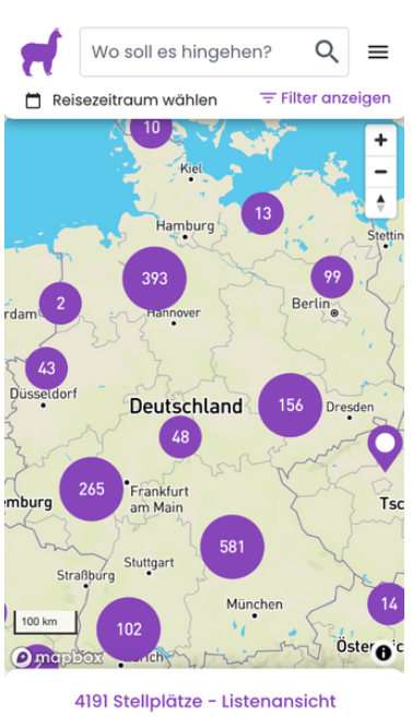
The search page represents the highest-traffic area on AlpacaCamping and serves as the main entry point into individual pitch pages.
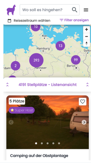
By default, users first land on a map and need to actively open the list view to see available pitches. The test aimed to simplify the experience by displaying both the map and a preloaded list of relevant pitches matching the user's search query.
Test results
The test reached 97.7% significance (frequentist method) and confirmed the hypothesis: showing pitch previews directly on the search page increased booking intent.
92,537 users were part of the experiment, with 803 unique purchases recorded. The variation outperformed the control in all key metrics related to engagement and conversion. As a result, it was rolled out to 100% of mobile users and later implemented directly into the live code.
Original
Variation
Conclusion
Visual previews are crucial for driving intent - users respond more strongly to property visuals and details than to the map itself. This aligns with learned behavior from other booking platforms.
An additional learning: the icons made the list view feel more interactive, likely solving a discoverability issue in the previous setup. Interestingly, users cared less about the exact location and more about the look and features of the pitch - highlighting the emotional nature of the decision-making process.
Final Takeaways
The experiment uncovered one of the most impactful entry points in the booking journey. It emphasized the importance of reducing friction and surfacing relevant content early - not just technically, but emotionally. As a result, the team prioritized further experimentation around the preview page, filters, and visual cues.
This test delivered lasting value by validating a simple UX shift with measurable impact - and unlocked a high-leverage area for continued optimization.
AlpacaCamping is a German-based online platform that connects travelers with unique, privately owned RV and camping pitches across Europe. By offering flexible booking options, real-time availability, and carefully curated locations, AlpacaCamping provides an alternative to traditional campgrounds.
The company has grown into one of the leading marketplaces for individual campsite experiences, catering especially to campervan owners seeking authentic and personalized stays in nature.
Initial situation
The search page represents the highest-traffic area on AlpacaCamping and serves as the main entry point into individual pitch pages.
By default, users first land on a map and need to actively open the list view to see available pitches. The test aimed to simplify the experience by displaying both the map and a preloaded list of relevant pitches matching the user's search query.
Test results
The test reached 97.7% significance (frequentist method) and confirmed the hypothesis: showing pitch previews directly on the search page increased booking intent.
92,537 users were part of the experiment, with 803 unique purchases recorded. The variation outperformed the control in all key metrics related to engagement and conversion. As a result, it was rolled out to 100% of mobile users and later implemented directly into the live code.
Original
Variation
Conclusion
Visual previews are crucial for driving intent - users respond more strongly to property visuals and details than to the map itself. This aligns with learned behavior from other booking platforms.
An additional learning: the icons made the list view feel more interactive, likely solving a discoverability issue in the previous setup. Interestingly, users cared less about the exact location and more about the look and features of the pitch - highlighting the emotional nature of the decision-making process.
Final Takeaways
The experiment uncovered one of the most impactful entry points in the booking journey. It emphasized the importance of reducing friction and surfacing relevant content early - not just technically, but emotionally. As a result, the team prioritized further experimentation around the preview page, filters, and visual cues.
This test delivered lasting value by validating a simple UX shift with measurable impact - and unlocked a high-leverage area for continued optimization.