"A good product solves problems. A usable product prevents new ones."
Whether an application is used or abandoned rarely depends on its appearance, but on its usability. It determines acceptance, frustration and commercial success. This article is about what usability really means, how it differs from UX, which criteria count and how teams can measure and improve it.

Table of contents
What is usability? Definition, meaning and origin
Usability describes how well an application or product helps to achieve goals efficiently, error-free and satisfactorily. It goes beyond mere appearance and relates to functionality and usability.
The official definition according to ISO 9241-11 is:
"Usability is the extent to which a product can be used by specific users in a specific context to achieve defined goals efficiently, effectively and satisfactorily."
The 5 central criteria of usability
| Criterion | Meaning | Example | What happens in the event of non-compliance? |
|---|---|---|---|
|
Effectiveness
|
Users reach their destination in full.
|
An online store enables the user to find and buy a product.
|
Users drop out because they can't reach their destination.
|
|
Efficiency
|
The goal is achieved with as little effort as possible.
|
A form can be filled out quickly and without unnecessary steps.
|
Users become frustrated and turn away.
|
|
Learnability
|
The application can be quickly understood without prior knowledge.
|
A software tool is self-explanatory and does not require lengthy instructions.
|
Users have to read long instructions, which makes it difficult to get started.
|
|
Fault tolerance
|
Errors are recognized, explained and intercepted.
|
An app displays an understandable error message if the user enters something incorrectly.
|
Users do not know how to rectify the error.
|
|
Satisfaction
|
It is pleasant, easy to understand and stress-free to use.
|
An app offers a user-friendly interface that is fun to use.
|
Users are annoyed and avoid using the application.
|
Usability vs. user experience (UX)
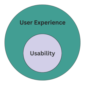
Usability exclusively describes user-friendliness. It is about whether a product can be used in a comprehensible, efficient and error-free manner.
UX, or user experience, is more comprehensive. It also includes emotions, trust and overall perception during and after use. Usability is a sub-area of user experience.
Example:
A form field with clear error messages is part of usability. The feeling of security during the entire payment process and satisfaction after delivery are part of the user experience.
An important difference: user experience also includes factors that are outside the direct control of the product team. Delayed shipping, a damaged delivery or an unfriendly hotline also have an impact on the user experience, even though the actual interface worked perfectly from a technical perspective.
Why poor usability is expensive and good usability pays off immediately
Poor usability is not a blemish, but a direct cost factor. If users do not reach their destination, abandonment rates, support costs and absenteeism increase. In e-commerce, this means missed sales. In SaaS or enterprise software: more training requirements and higher error rates.
Studies show that companies not only increase conversion rates through user-friendly systems, but also reduce support costs and allow employees to work more productively. Good usability therefore often pays for itself in a short time.
Examples:
An online store reduces form fields in the checkout and thus increases the completion rate by double-digit percentages.
A company integrates comprehensible error messages and thus significantly reduces the number of support tickets.
Internal software with a clear structure saves several minutes per employee every day, which means considerable sums of money for large teams.
How to measure usability: methods, metrics and tools
Usability cannot be evaluated by gut feeling alone. It must be made measurable in order to make well-founded decisions. There are qualitative and quantitative methods that complement each other.
Qualitative methods
They provide deep insights into the behavior and thinking of users.
- Observation: Users are observed while working on a task. Problems and obstacles become visible.
- Interviews: After use, users describe their experiences and where they had difficulties.
Quantitative methods
They provide hard figures and allow comparisons to be made.
- Task completion rate: Percentage of users who successfully complete a task.
- System Usability Scale (SUS): A standardized questionnaire that reflects usability in a score.
- Error rate: Frequency of errors during use.
Test types
- Moderated tests: A moderator guides you through the tasks, can ask questions and go into more detail.
- Remote tests: Users work independently and the results are recorded automatically.
Tools
Specialized tools that collect and visualize data are suitable for support:
The 10 usability principles according to Nielsen
Jakob Nielsen's ten heuristics have been a core tool for evaluating usability since the 1990s. They are deliberately formulated in general terms and can be applied to any type of digital product.
1. visibility of the system status
Users should know what is happening at all times.
Example: Loading bars or confirmations after a click.
2. correspondence between the system and the real world
Language and processes should meet user expectations.
Example: A recycle bin icon for deleted files.
3. user control and freedom
Users need options to undo or cancel actions.
Example: Undo function in word processing programs.
4. consistency and standards
The same actions should always look and work the same.
Example: A "Save" button that is in the same place in all modules.
5. error prevention
The system should prevent errors before they occur.
Example: Mandatory fields in the form are clearly marked.
6. recognizing instead of remembering
Users should see options instead of having to keep them in their heads.
Example: Drop-down menus instead of free input.
7. flexibility and efficiency of use
The system is designed to suit both beginners and professionals.
Example: Shortcuts for power users in addition to menu options.
8. aesthetics and minimalist design
Information should be presented clearly, simply and without ballast.
Example: Clear forms without unnecessary fields.
9. support users in the event of errors
Error messages should be comprehensible and offer concrete solutions.
Example: "Password must have at least 8 characters" instead of "Error 401".
10. help and documentation
Even if a system should be simple, help must be readily available.
Example: Short help texts or a built-in FAQ.
Systematically optimize usability
Usability is not a one-off project, but an ongoing process. For it to be effective, it must be firmly integrated into the product development cycle.
Integrating usability into the process
Usability tests should take place from the initial concept phase through to ongoing operation. Short feedback loops prevent problems from being discovered late, when corrections are expensive.
Convince stakeholders
Decision-makers are not convinced by gut feeling, but by figures. Key figures such as abandonment rate, task completion or support tickets are strong arguments for investing in usability.
Establish a culture of error
Tests reveal weaknesses. Teams that see usability as an opportunity improve products faster. Criticism of the product must not be understood as criticism of the people.
A/B Testing
In addition to classic usability tests, A/B tests help to directly compare variants with each other. This makes it clear which version gets users to their destination better. Tools such as Varify.io make it easier to carry out tests by simply integrating them into existing product environments. This allows hypotheses to be tested quickly and confirmed or rejected based on data.
Conclusion
Usability determines whether a product is accepted or rejected. It is the basis for successful digital products and not a nice extra. A good design is not enough if the operation does not work.
The core message is that a product can only achieve its full value if users achieve their goals effectively, efficiently and satisfactorily.
Those who take usability seriously save costs, increase satisfaction and create the basis for sustainable success.