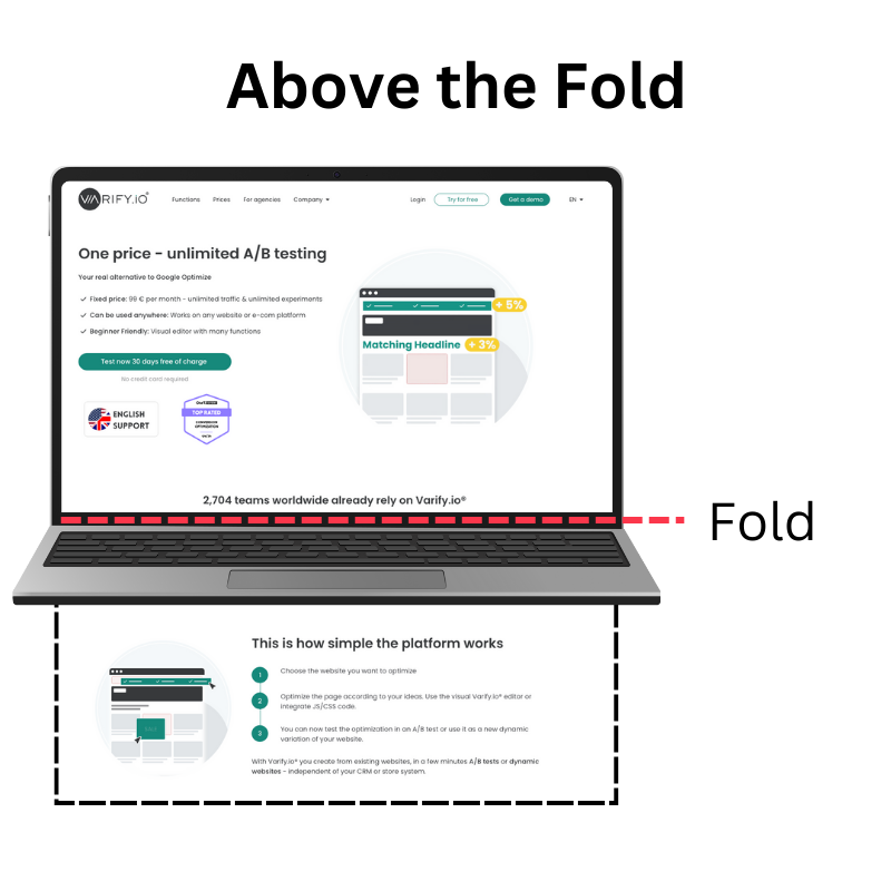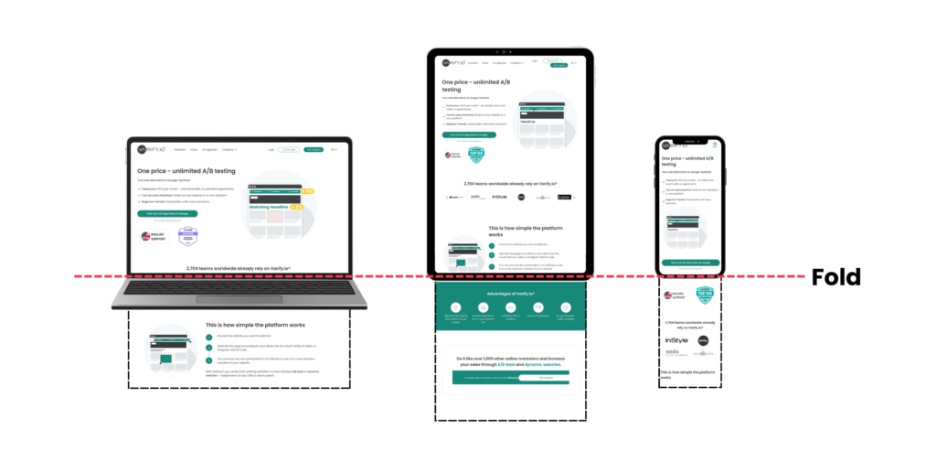
"Above the Fold": Visible area without scrolling, important for the first impression.
"Below the Fold": Content that only becomes visible when scrolling.
Visitors to a website decide in a flash: stay or go?
The visible area when your page is first loaded plays a decisive role here.
But the content that appears after scrolling should not be underestimated either.
In this article, we will show you how to optimize these two levels to promote attention, trust and interaction.

Table of contents
Origin of Above the Fold
The term "Above the Fold" originates from the world of print journalism, more specifically from the newspaper industry. In the past, newspapers were often stacked or laid out folded so that readers could only see the top half of the front page at first glance. To attract attention, publishers placed the most important headlines, images and lead stories there - the content that would immediately persuade readers to buy the newspaper.
With digitization, this concept migrated to web design. Here, too, it quickly became clear how important the first visible area of a page is. Content that immediately catches the eye and is visible without scrolling often decides whether a user stays or clicks on. The Hero Shot is a central element of this area and attracts the attention of visitors while often communicating the main message of a page.
Meaning of Above the Fold in web design
First impressions count - this applies not only to personal encounters, but also to websites. The above-the-fold area is the first section that visitors see without having to scroll. The first few seconds decide whether a user stays or leaves the page.
A well-designed visible area can:
Improve the user experience (UX): Clear structures and an appealing design help visitors to find their way around immediately.
Increase conversion rate: Important elements such as call-to-actions (CTAs) in the above-the-fold area can address users directly and increase the likelihood that they will perform a desired action.
Build trust: A professional and tidy design conveys seriousness and competence.
However, "above the fold" does not mean that all important information has to be squeezed in. Rather, it is about motivating visitors to scroll or take action by strategically placing the most important content.
Best practices for an above the fold area
There are several best practices for designing the Above the Fold area to target users and motivate them to interact:
- Make important information immediately visible: The central message and calls to action (CTAs) should be recognizable at first glance without the user having to scroll.
- Use visual elements in a targeted manner: High-quality images or videos help to attract attention and arouse emotions. An uncluttered design ensures better readability.
- Avoid overloading: Too much text or design elements can overwhelm visitors. A clear hierarchy and sufficient whitespace improve user guidance.
- Optimization for different devices: The above-the-fold area varies depending on the screen size, which is why a responsive design is essential. Especially on mobile devices, it must be ensured that content is not cut off or displayed in a confusing way.
- Use A/B tests for optimization: Tests can be used to compare different layouts, images and texts to find out which version achieves the best results.
If you follow these best practices, you will ensure a strong first impression and increase the likelihood that visitors will stay on the page and convert.
SEO: Why the visible area counts
The visible area of your website is not only important for the first impression of your visitors, but also plays a central role in search engine optimization (SEO). Google rates the user experience highly, and this area is a decisive factor.
A fast loading time is particularly important here, as heavy images or unoptimized content can slow down your site and negatively affect your ranking.
The content in this section is also crucial for SEO: relevant keywords should be visible here in the headline and in the first section of text in order to attract both visitors and search engines directly. At the same time, you should ensure that this section is optimally displayed on mobile devices, as Google primarily evaluates the mobile view.
A clearly structured and appealing visible area also promotes dwell time and reduces the bounce rate - positive user signals that further improve your ranking. With a well thought-out design, you not only create a better user experience, but also send important SEO signals to Google.
Above the fold on mobile devices: Responsive design

With the increasing use of smartphones and tablets, the concept of Above the Fold has changed. The visible area varies depending on the screen size, which is why a responsive design is essential.
Since the introduction of mobile-first indexing, Google has prioritized the mobile version of a website for its ranking. Pages that are poorly optimized on mobile devices can lose visibility as a result.
A mobile-friendly design not only ensures a better user experience, but can also have a positive impact on SEO and conversion rates.
The relevance for conversion optimization
The "above the fold" area is not only crucial for the user experience, but also for conversion optimization. Studies have shown that elements that are immediately visible have a higher interaction rate than elements that are placed further down the page.
Therefore, it is important to place the most important information and calls to action in the "Above the Fold" area. This can help increase the visibility of these elements and encourage visitors to perform the desired actions, which ultimately leads to higher conversion rates.
Different sectors, different above-the-fold strategies
Not every industry uses the above-the-fold area in the same way - because what works for a news website is not necessarily ideal for an online store or B2B software. Here is an overview of how different industries use the visible area of a website optimally:
1. e-commerce: focus on conversion
Online stores often use the above-the-fold area specifically for sales. Typical elements are
- Main offers & discounts: Large banners with current deals or seasonal promotions.
- Product recommendations: Bestsellers or personalized suggestions directly visible.
- Call-to-action (CTA): Clear buttons such as "Buy now" or "Add to cart".
Example: A fashion store shows a large picture of the latest collection with a "Discover now" button in the header.
2. news & publishers: maximum attention for content
News websites need to ensure that readers see relevant headlines immediately. Therefore, the focus here is on:
- Top news: Usually a large, central image with the most important headline.
- Live ticker or breaking news: Important updates are displayed as banners.
- Categorized articles: Different sections (politics, sport, business) are often directly accessible.
Example: A news website highlights the most important headlines with concise images and short teasers.
3 SaaS & B2B websites: Clear value propositions
For software and B2B companies, the aim is to communicate the benefits of a product immediately. Typical elements:
- USP (Unique Selling Proposition): A clear statement of what the product can do.
- Demo or test registration: Directly visible buttons such as "Test for free".
- Logos & trust signals: Customer logos or ratings for trust.
Example: A CRM platform displays a short, clear message ("Increase your customer loyalty with smart automation") with a "Try for free" button.
Conclusion
The above-the-fold area is far more than just the top section of a website - it is the first interaction with the user and can play a key role in deciding whether they stay or bounce. The requirements and focus vary depending on the industry, but the goal remains the same: to clearly present relevant content and guide users in a targeted manner.
A well-thought-out design that is both visually appealing and functionally optimized ensures a better user experience and increases the conversion rate. Those who use this area strategically create a website that not only delights visitors, but also delivers measurable success.
Individual references
Goesch, Robert: Debunking the Myth of the Fold. [Accessed on: 14.03.2025]
Jahromi, H.Z.; Delaney, D.T.; Hines, A.: Predicting the Perception of Above-the-Fold Time in Web Browsing. [Accessed on: 15.03.2025]
Jahromi, H.Z.; Delaney, D.T.; Hines, A.: How Crisp is the Crease? A Subjective Study on Web Browsing Perception of Above-The-Fold. [Accessed on: 17.03.2025]

