Increase in clicks on a timeline with baby products on the homepage
Result:
E-commerce
Belgium
+ 13,66% Add To Cart
Table of contents
About QLEVR
QLEVR brings together five strong brands, such as Puckababy, that offer innovative, high-quality products for babies and toddlers based on real needs and thorough research into the preferences of young parents.
Puckababy specializes in premium baby sleeping bags that ensure safe, comfortable and restful sleep for infants. By combining high-quality materials with thoughtful design, Puckababy products support healthy development and give parents peace of mind.
Initial situation
This case study explores how a simple layout adjustment to a timeline on the homepage improved user engagement and navigation explanation. The element tested - a timeline with baby product categories - plays a central role in guiding customers through their shopping experience and helping them to quickly identify relevant products based on their child's age.
An A/B test was conducted on the homepage - one of the most frequently visited pages and an important entry point for both new and returning customers. As visitors arriving here are often still at the beginning of their product exploration, the homepage was the ideal place to test improvements in user engagement and navigation.
Behavioral data and heatmap analysis from Microsoft Clarity had shown that the timeline was a highly interactive element, but not as intuitive as expected. Many users interacted with it, but had difficulty exploring the entire content due to the horizontal layout, which indicated a need for optimization.
Test setup
A classic A/B test was carried out on the homepage for all language versions. This setup allowed the team to measure the direct impact of layout alignment on user interactions and conversion-related behavior.
Segmentation: Mobile users only.
Duration: About one month.
Goal / Motivation
The main goal of this test was to increase clicks on the timeline and thereby achieve higher sales figures through clearer navigation.
Variants
Hypothesis
If the timeline is displayed vertically instead of horizontally,
Then clicks and overall clarity will increase,
Because users can process relevant content more easily and navigate more quickly through the available product categories.
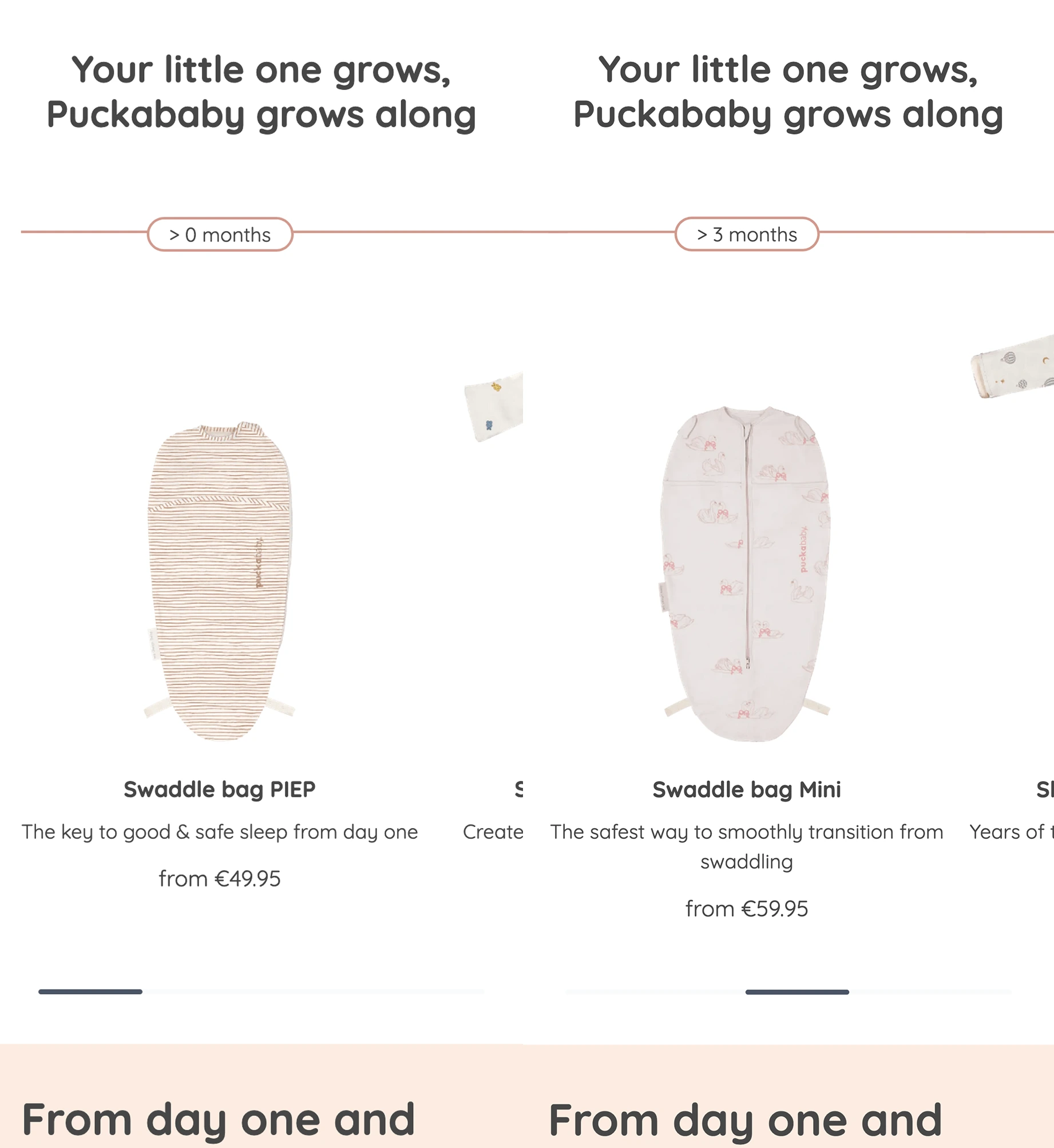
Original
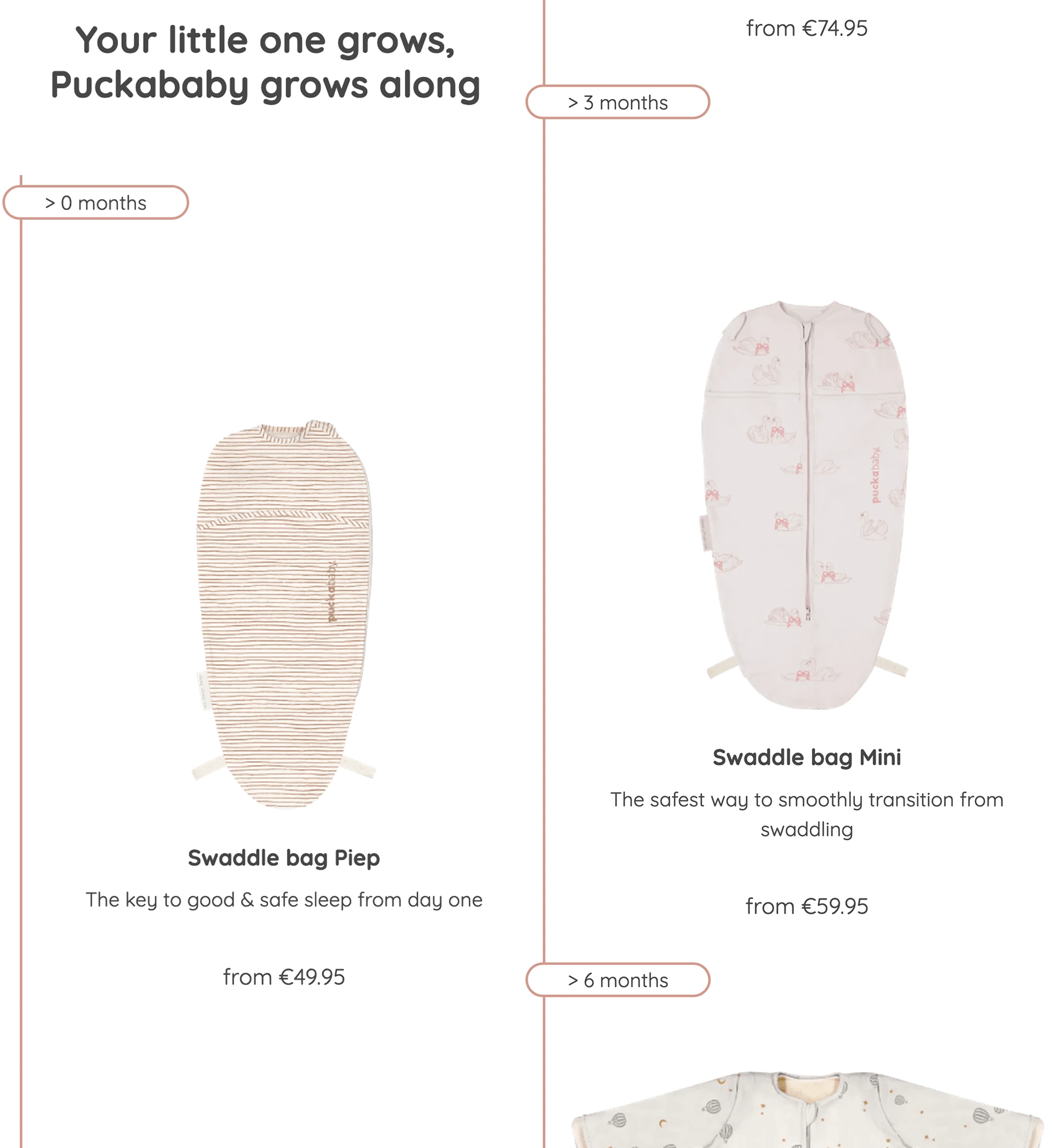
Variant
Changes:
Original: Horizontal timeline of baby product categories.
Variant: Vertical timeline arrangement to improve visibility and scrolling behavior.
Test results
The change brought a strong and statistically significant improvement:
+ 12.58% more Clicks (99% significance)
+ 13.66% more Add-to-cart promotions
+ 5.10% Increase in ARPU (average revenue per user)
The results confirmed that important content should not be hidden behind sliders. Users interact more effectively when the important information is immediately visible, improving clarity and speed of decision making. The vertical layout not only improved the user experience, but also had a measurable impact on sales-related metrics.
Conclusion
The vertical timeline clearly outperformed the horizontal version and was rolled out immediately. The results confirmed the importance of accessibility and visibility in navigation design. Going forward, the team plans to further refine this element - exploring more visual cues and interactive features to make the timeline even more intuitive and engaging.
Implementation with Varify
Varify offered fair pricing, easy setup and excellent documentation, as well as a clear demo. It allowed us to quickly test the timeline variations on mobile devices and reliably track user interactions, making the process efficient and straightforward.
Varify is well documented and easy to set up. The connection with GA4 allows us to create detailed reports quickly and efficiently. This combination of ease of use and robust analysis provides reliable insights and supports data-driven decision making.

Head of E-commerce Infrastructure at QLEVR
Head of E-commerce Infrastructure